
Imagine a simple chart that could really change healthcare. Data visuals turn endless numbers into bright, easy-to-read pictures that help hospitals, labs, and clinics make smart choices. Picture a dashboard that instantly shows you treatment progress and patient flow, all in one look. This clear snapshot spots problems early and boosts overall care. With the healthcare analytics market growing fast, these visual tools are quickly becoming key to turning raw data into actions that change lives.
How Data Visualization Transforms Health Analytics
Data visualization in health analytics turns huge piles of complicated data into clear, easy-to-understand pictures. It helps hospitals, research centers, pharma companies, and insurers make quick decisions by showing trends and key numbers in one look. Imagine a clinical chart that shows how patients move through care and how well treatments work, all in one interactive snapshot. That’s what performance plotting really does.
Ever heard that in 2022, the global healthcare analytics market hit $35.3 billion? And it’s growing at an impressive rate of 21.4% per year, with predictions reaching up to $167.0 billion soon. This shows just how important and trusted visual tools have become in sharing vital medical information.
By turning endless numbers into charts, timelines, and scatter plots, visual insights help everyone, from doctors and nurses to patients and policymakers, spot trends, catch problems early, and make smart choices. Interactive dashboards now form the backbone of modern health strategies by presenting complex data in friendly, user-focused ways. This clear approach lets medical staff quickly see patient care challenges and opportunities, turning raw numbers into insights that improve both daily operations and overall patient outcomes.
Tools and Techniques for Data Visualization in Health Analytics

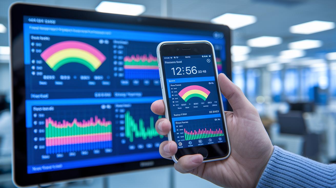
Interactive dashboards, apps, widgets, infographics, motion graphics, geospatial maps, and time-series visualizations are at the heart of today’s health analytics. They take large amounts of data from hospitals, clinical trials, wearables, and electronic health records and turn it into insights you can easily act on. For example, at Saint Joseph Mercy Health System, iDashboards offer instant feedback that helps staff make speedy care decisions. And the CDC’s National Syndromic Surveillance Program uses live data dashboards to watch public health trends as they happen.
Interactive dashboards are especially powerful. They pull together different views into one clear report so you can dive into patient outcomes and performance right away. Plus, they connect with other software to give real-time updates. This means medical teams can spot trends and potential problems early, before they get serious.
Tableau
Tableau is a favorite because it uses a simple drag-and-drop interface that makes data analysis a breeze. With built-in real-time connectors and community support, it quickly turns raw numbers into interactive charts. For example, when keeping track of patient flow, you can watch data transform into easy-to-read graphics that show progress at a glance.
Domo
Domo shines with its outstanding real-time data integration. Its app-building tools and mobile-first design let healthcare providers get crucial updates on the go. Custom reports mean health teams can easily monitor everything from supply levels to patient vital signs with just a few taps.
Bold BI
Bold BI lets you embed dashboards smoothly into different systems. By using its robust software development kit, you can create reports that work across many environments and even customize them with your own branding. This way, data visualization stays consistent and simple for everyone who needs it.
Best Practices and Methodologies for Effective Health Analytics Visualization
Clear visuals start with well-organized data. When you split information into neat groups, teams can spot trends and work faster. Real-time updates mean that new data shows up the moment it's available, which is super important in fast-paced care settings.
Interactive designs let users zoom into details without feeling overwhelmed. And it all starts with building in safety checks like HIPAA and GDPR. This way, every visualization stays secure and trustworthy.
When designing for doctors, managers, or patients, the display should be easy to use. Infographics, charts, and plots need to be simple enough for anyone to understand quickly so that decisions can be made right away. Fast analysis of large data sets not only boosts patient care but also helps use resources more wisely by cutting through the clutter.
- Validate and clean your data before you create visuals.
- Use a consistent color palette and icons.
- Add interactive filters so users can explore data their way.
- Design charts that scale well with different amounts of data.
- Build in compliance checks for HIPAA and GDPR from the start.
- Tailor different views for clinical, administrative, and patient audiences.
- Ensure your visuals update in real time for the most accurate insights.
Real-World Examples: Case Studies in Health Analytics Visualization
St. Joseph Mercy Health System Dashboard
At Saint Joseph Mercy Health System, they quickly put iDashboards in place to help care teams see how they’re doing right away. They started small with a test pilot in one unit and then expanded the tool to the entire hospital. The dashboards show key metrics like how fast patients move through the system, if patients come back to the hospital, and how long treatments take. One dashboard even displays real-time patient flow, which helps spot slow spots and chances to make care run smoother. Staff love it because watching the numbers update live gives them the confidence to change things on the fly, ensuring help goes exactly where it’s needed.
CDC Syndromic Surveillance Dashboard
The CDC’s National Syndromic Surveillance Dashboard is built to keep an eye on public health issues as they happen. It pulls data from emergency room visits, lab reports, and even watchful insights from wearable devices. The dashboard sends out alerts when certain numbers go above normal, like a sudden jump in breathing problems during flu season. This quick alert system helps officials catch outbreaks early so they can act fast. With all the different data streams shown in one clear view, this tool is a real game-changer for preventing diseases before they spread further.
Aetna Cost-Saving Visualization
Aetna uses interactive charts to spot patterns in high-cost services, which helps target areas where spending can be trimmed. These charts break down spending on expensive treatments so teams can see which ones push the costs up the most. This visual method makes discussions with providers much clearer when it comes to negotiating better prices. One analyst said, "The charts highlight spending hotspots, making it easier to focus on reducing extra costs." With this approach, Aetna is able to manage resources more wisely and save money without compromising care.
Advanced and Interactive Visualizations in Health Analytics
Interactive dashboards bring many smaller reports together into one clear view of a patient’s care. They offer friendly metric panels where health pros can quickly check details like patient outcomes, resource use, and clinical performance. For instance, one dashboard might show several charts you can filter to compare treatment differences by age group or region. And with interactive maps, you can easily see geographic trends in patient data.
Dynamic infographics turn big sets of statistics into simple, visual stories. Imagine a graphic that shows rising emergency room visits during the worst of flu season or spots a sudden drop in hospital admissions. These visuals help everyone understand important trends without getting lost in complex numbers. They quickly highlight patterns so busy professionals can focus on making smart, actionable decisions.
Custom visualization frameworks neatly blend data from many sources into clear reports. They pull information from systems like EHRs, EMRs, sensor data, and even third-party platforms, all tailored for the needs of health organizations. In tricky, data-heavy environments, these tools quickly adjust to different data formats and live updates (https://healthlystats.com?p=67). This means you can interact with your data on many levels, giving you the most current insights to support every decision.
Implementation Challenges and Solutions in Health Analytics Visualization

When you bring together data from different places like hospital records and wearables, things can get bumpy. One common problem is fixing data quality issues while following strict rules like HIPAA and GDPR (these are laws that protect patient information). This often means hospitals need to build custom software and team up with trusted vendors. Imagine a dashboard that shows patient check-ins right next to test results without any lag, it's all about making different data streams work well together.
Another tricky part is making sure that graphics showing trends over time stay accurate, even when the data updates all the time. Creating charts that show real-time info means using live data feeds and careful checks to keep everything in line. And then there are tools that mix old data with predictions about the future, which adds another layer of challenge.
Even with the healthcare analytics market projected to jump from $11.5 billion in 2019 to $40.8 billion by 2025, issues like isolated data and mixed standards still stick around. By tackling these problems with smart integration and regular compliance checks, we can turn raw numbers into clear insights that help make better decisions and improve patient care.
Final Words
In the action, we explored how turning raw health data into clear, visual charts helps everyone, from clinicians to patients, make smarter decisions. We covered ways to build user-friendly dashboards, use core software like Tableau, and see the impact through real-world success stories.
We also showed practical tips to design visual tools that highlight key trends. Embrace data visualization in health analytics to make daily health tracking simpler and more effective. Positive change is just a chart away.
FAQ
What are some healthcare data visualization examples?
Healthcare data visualization examples include interactive dashboards, bar charts, timelines, and scatter plots that help track patient outcomes, hospital performance, and outbreak patterns.
What are the types of data visualization in health analytics?
Data visualization in health analytics covers charts, dashboards, infographics, motion graphics, and maps often featured in presentations, which simplify complex medical information for quick decision-making.
What is the role of data visualization in healthcare analytics?
Data visualization in healthcare analytics transforms complex numerical data into clear charts and graphs, making it easier for clinicians and policymakers to spot trends and make informed, fast decisions.
What are public health data visualization examples?
Public health data visualization examples include real-time dashboards that track emergency visits, lab reports, and outbreak alerts, allowing communities to effectively monitor and respond to health emergencies.
What do healthcare data visualization jobs involve?
Healthcare data visualization jobs involve creating engaging, interactive graphics and dashboards that translate big data into clear insights, supporting clinicians and administrators in improving care delivery.
What are the 5 C’s of data visualization?
The 5 C’s of data visualization include context, clarity, consistency, color, and connectivity, which together ensure that visual data representations are understandable and useful for health data users.
What are the 4 types of data analytics in healthcare?
The 4 types of data analytics in healthcare are descriptive, predictive, prescriptive, and comparative analytics, each offering unique insights to help improve patient care and optimize resource allocation.