
Ever wondered if one simple chart could change how you see health care? Health data visualization turns piles of numbers into clear, easy-to-read pictures that quickly tell a story.
It’s like turning on a light in a dark room. In a flash, you can see busy emergency room hours or spot trends in patient care. This clear view helps health teams focus on what matters most, making tough decisions a bit easier and care even better.
Why Health Data Visualization Matters for Healthcare Professionals
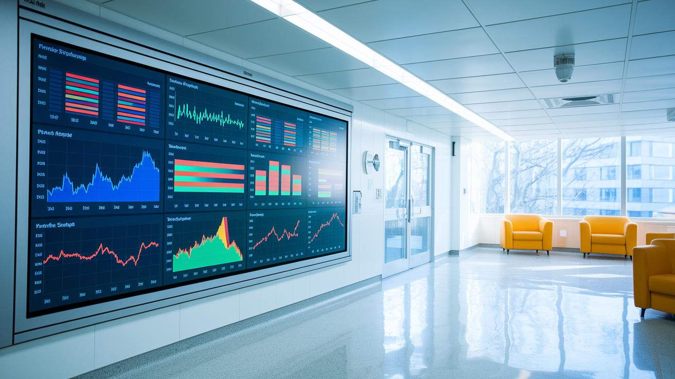
Visualizing health data really makes a difference for busy healthcare workers. It turns complicated numbers and text into easy-to-read charts, graphs, and tables. For instance, a simple line chart showing patient flow can quickly point out the busy hours in the emergency room, saving you the hassle of searching through piles of spreadsheets.
These visual tools help us see important details like patient satisfaction, bed occupancy, and staff-to-patient ratios. Ever notice how a clear graph can make trends pop out at you? With this kind of insight, healthcare leaders can spot patterns and make better decisions about where to put resources. One surprising fact is that before visual dashboards were used, hospitals often had trouble managing patient flow, which slowed down responses during hectic times.
Market trends also show just how important these tools have become. Reports highlight that the global healthcare data analytics market might grow from $11.5 billion in 2019 to $40.8 billion by 2025. This growth tells us that more hospitals are turning to clear visual data to speed up decision-making. In fact, more than half of healthcare organizations planned to use data integration technology by the end of 2021.
All of this helps simplify complex health data, turning abstract trends into smart, data-driven strategies. With clear visuals, clinicians see risks at a glance while administrators get a full picture of operations. This clarity not only improves patient care but also ensures that time is spent on action rather than guesswork. In truth, real-time visuals can help create a proactive and evidence-based approach in healthcare.
health data visualization sparks brilliant clarity

Interactive dashboards, apps, and widgets are changing the way clinicians and administrators look at patient information. They pull live data into simple displays that let you see details at a quick glance. Imagine a dashboard that shows vital signs like blood pressure, heart rate, and temperature as they happen. It turns numbers into easy visuals so you can spot trends and shifts without hassle. For example, when patient monitoring devices send updates in real time (think Wearable Tech for Health), the graphs refresh instantly so you always have the latest info.
Infographics and motion graphics help a lot too. They turn complicated statistics into visuals that are engaging and easy to follow, kind of like that well-known breast cancer infographic that makes tough data more approachable. These visuals mix color coding with gentle animations to highlight important details and guide you through the numbers. Then there are line and bar charts that break down the data even further, showing steady trends as well as sudden changes in patient conditions.
| Technique | Benefit |
|---|---|
| Interactive dashboards | Custom views that adapt to different needs |
| Infographics | Turn tough data into stories you can understand |
| Line & Bar charts | Quick snapshots of trends and changes |
All these approaches bring a clear spark to healthcare data, making it easier for everyone to understand and take action on the information that matters.
Top Software Tools for Health Data Visualization
Datylon’s suite really shines because it offers a bunch of custom solutions. Their tools, Foundry, Report Studio, ChartRunner, and Report Server, help you create clear, personalized reports that tell your data’s story. Imagine putting together a dashboard that updates in real time, kind of like a chef making sure every dish has the freshest ingredients.
Well-known tools like Tableau, Domo, and Bold BI are also popular with top healthcare groups. Big names like UNC Health and Pfizer trust Tableau to turn patient data into visuals that clearly show what’s going on. Domo’s real-time dashboards let you see trends as they happen, and Bold BI gives you the flexibility to adjust every detail to fit your needs.
Custom-built solutions are a hit because they mix different data sources into one clear picture. They bring together automated reports, interactive charts, and smooth connections so you get a full view of health records. For more on how data integration works, check out Healthcare Analytics (https://healthlystats.com?p=140). New platforms are pushing innovation, too, Digital Health Tech (https://healthyfax.com?p=694) is one example that shows fresh ways to connect clinical data instantly.
| Software | Main Benefit |
|---|---|
| Datylon Suite | Bespoke visual reporting and custom integration |
| Tableau | Trusted by major healthcare providers for clear insights |
| Domo | Real-time dashboards to capture fast-changing data |
| Bold BI | Fully customizable dashboards for tailored analysis |
Designing Effective Clinical Dashboards with Health Data Visualization
Clinicians often need a quick glance at vital info. Real-time dashboards bring key data like patient vitals, appointment schedules, and waiting times together in one spot. Imagine a dashboard that instantly updates when a patient's temperature changes, it alerts staff right away if something’s off. Think about a line chart tracking treatment progress paired with a bar chart showing waiting times. This clear setup helps you quickly spot trends and any unusual changes.
A smart dashboard keeps the most important numbers front and center. For example, use line charts to follow patient vitals like heart rate and blood pressure [the force of your heartbeats, measured to show how your heart works] and bar charts to lay out appointment schedules and treatment milestones. This mix makes it easy to notice quick changes as well as overall trends.
Interactive dashboards also mean less waiting around for reports. When updates come in real time, clinicians can spot risks sooner and handle resources more effectively. Visuals like bed occupancy maps and staff-to-patient ratios make it simple to see busy times or when care might be stretched thin.
- Keep primary patient care metrics in the spotlight
- Integrate real-time data feeds for the most current info
- Use clear, easy-to-read charts that show different types of data
By blending dynamic data with clean, organized layouts, these dashboards let healthcare providers make smart, quick decisions every day.
Ensuring Standards and Privacy in Clinical Health Data Visualization
FHIR standards help different systems talk to each other by giving everyone one clear set of rules. They make sure that data from various sources can be combined into one reliable picture. Imagine a dashboard that brings together blood test results and imaging data into one neat report – it’s secure, simple, and easy to understand.
Patient privacy is a top priority. That’s why rules like HIPAA require things such as encryption, tight access controls, and detailed audit trails. Think of it as every chart and graph being locked up safely, like a trusted vault that only the right people can open. This keeps patient data safe and builds trust in digital health tools.
Good design is key to making sure visuals are both clear and engaging. Designers follow easy-to-understand guidelines for labeling charts, picking the right colors, and adding helpful notes. Using high-contrast colors is like drawing a clear map where every detail stands out and can be easily followed.
Here are the three main focus areas:
| Focus Area | What It Does |
|---|---|
| FHIR Standards | Makes sure all systems share data in the same way |
| Security Measures | Protects each piece of data with encryption and controlled access |
| Design Guidelines | Ensures charts are clear with proper labeling and bright, distinct colors |
With these clear and simple practices, clinical health data visualizations become trusted, easy-to-read, and secure for everyone.
health data visualization sparks brilliant clarity

Real World Case Studies
Using visuals makes it easier for healthcare teams to make fast decisions. During the COVID crisis, dashboards with line charts, heat maps, and trend graphs quickly spotted rising hotspots. One surprising fact is that a dashboard helped shift resources in hours instead of days.
Johns Hopkins transformed complex breast cancer data, like rates of illness, death, and prevention tips, into clear, easy-to-understand images for clinicians and the public. In another case, visuals of Medicare data revealed misuse costs ranging from $58.5 billion to $83.9 billion each year, which led to tighter controls.
- COVID-19 dashboards paved the way for a rapid response.
- Breast cancer visuals turned dense stats into accessible insights.
- Medicare charts clearly highlighted where money was misused.
Technical Insights for Decision-Making
Visualization tools blend interactive features with detailed data layers, giving health professionals a powerful edge. With tools such as interactive dashboards and widgets, real-time case tracking pairs up with historical data for a clear picture. For example, fraud detection charts help administrators zoom in on risky areas by showing financial misallocations. These simple methods break down big data sets and highlight key trends, supporting smarter clinical decisions.
| Case Study | Outcome |
|---|---|
| COVID-19 Dashboard | Quick adjustments in resource distribution |
| Breast Cancer Infographic | Key stats simplified for everyone |
| Medicare Fraud Visualization | Clear focus on areas with risk of misuse |
Best Practices for Crafting Impactful Health Data Visualizations
When you create visuals that share health data, keeping things clear matters a lot. Start with a clean layout that uses the same colors and simple labels, so anyone can quickly see what the data means. For example, you might begin with a basic chart showing patient recovery times, letting trends tell the story. A simple design helps viewers focus on important numbers without getting overwhelmed by clutter.
Next, add notes to highlight key details and turn plain numbers into a story. Think of it like following someone's journey from diagnosis to recovery, where each note marks an important milestone. This approach makes complex data feel familiar and easy to understand for doctors, managers, and patients alike.
Remember that different groups might need different details. Doctors may want detailed graphs, while managers could prefer summary charts. Keeping visuals straightforward and accessible helps everyone grasp the message quickly. When your design stays consistent and attractive, it builds trust and makes abstract numbers turn into practical insights for better health decisions.
Final Words
In the action, we saw how clear charts, interactive dashboards, and real-time tools turn health data into actionable insights. Our guide broke down the key techniques, top software choices, and privacy standards that keep patient details safe. We also highlighted real-world examples that put data into a relatable context.
This recap shows that effective health data visualization supports smarter health decisions and daily vitality. Keep exploring these practical approaches for a healthier, data-informed future.
FAQ
Frequently Asked Questions
Q: What are some examples of health data visualizations?
A: Health data visualizations include infographics, charts, tables, and interactive dashboards that represent patient satisfaction, flow metrics, bed occupancy, and staff ratios, making complex numbers easy to grasp.
Q: How can health data be visualized effectively in PowerPoint presentations?
A: Health data in PowerPoint is showcased through clear templates, simple charts, and concise infographics that break down complex metrics, helping audiences quickly understand clinical data during presentations.
Q: How is data visualization used in healthcare to enhance patient care?
A: Data visualization in healthcare converts complex medical information into clean graphs and dashboards, letting care teams spot trends and allocate resources swiftly to improve patient outcomes and clinic operations.
Q: What job roles focus on healthcare data visualization?
A: Positions in healthcare data visualization include roles like data analysts, visualization specialists, and clinical informatics experts who design and manage visual reports to streamline medical decision-making.
Q: What are the 5 C’s and 4 pillars of data visualization?
A: The 5 C’s and 4 pillars emphasize clarity, consistency, context, comparison, and creative presentation, guiding professionals to design visuals that are accurate, accessible, and effective for decision-making.
Q: What are the four types of data analytics used in healthcare?
A: Healthcare uses four data analytics types—descriptive, diagnostic, predictive, and prescriptive—to review past performance, identify causes, forecast trends, and recommend optimal actions for better care.
Q: What data visualization tools are available for healthcare professionals?
A: Tools like Tableau, Domo, and Bold BI, along with custom-built platforms, offer flexible dashboards and real-time displays that transform diverse health data into clear, actionable insights.