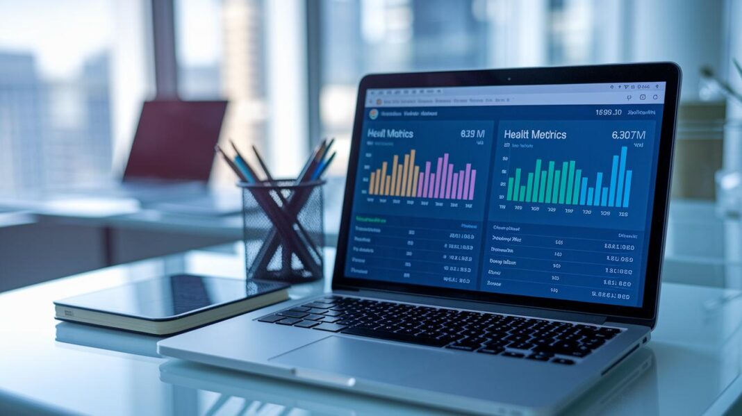
Have you ever noticed that some health dashboards feel more confusing than helpful? Think of it like a tidy bookshelf where everything has its place.
In this blog post, we’ll show you simple and smart ideas to keep your health numbers easy to read. We explain how a clear design can give you quick insights without feeling overloaded.
We also share a friendly guide with easy design steps and interactive features that adjust to your needs. This way, both healthcare providers and patients can enjoy a dashboard that really works.
Ready to discover these smart ideas? Let’s get started.
Core Design Principles for Health Metrics Dashboard Design
A simple and clear design makes a dashboard really easy to use. When every part has its own space, like a neatly labeled bookshelf, you can quickly find the information you need, whether it's hospital admissions or lab results.
Think of the layout as a friendly map: it guides you with a clear hierarchy and consistent design, making it effortless to see what matters most. Just like arranging your favorite books in order, each section is distinct and inviting.
Modern dashboards are all about smart features like AI-driven insights and privacy-first design. They learn from your habits to offer useful tips and alerts, ensuring you’re never overwhelmed even with lots of details on patient satisfaction.
For example, an interactive feature might let you click to see more about a trend without cluttering the main view. Studies show that better privacy controls can boost how often users engage by 40%, which leads to happier and more active users.
When you blend a clean layout with personalized tips and strong privacy, the dashboard becomes a powerful tool for both healthcare providers and patients. It’s like a well-organized toolbox where every tool is exactly where you expect it to be, ready to help you make smarter decisions.
Selecting and Displaying Key Health KPIs in Your Dashboard

When you set up your dashboard, start by thinking about who will use it. Whether it’s doctors, nurses, or wellness experts, choose health indicators that match what they need. This helps everyone quickly see important details and make smart decisions.
- Hospital admissions
- Lab results
- Billing information
- Patient satisfaction scores
- Daily steps count
- Sleep quality measurements
Each of these measurements is key when it comes to understanding health and making choices. For example, hospital admissions and lab results show how well treatments might be working, while billing information points to how the finances are doing. Patient satisfaction scores give a direct peek into how people feel about their care, which is vital for constant improvement. Daily steps and sleep quality help users see everyday trends in their wellness, so they can adjust their habits if needed.
By carefully choosing and clearly showcasing these indicators, your dashboard turns into a strong tool for making decisions. Data visualizations change raw numbers into easy-to-understand stories, helping healthcare teams spot trends, respond to problems quickly, and deliver better care overall.
UX Guidelines for Responsive Clinical Dashboards
Responsive design makes your clinical dashboard work smoothly on any device. Think of a clean layout like the ClickUp template with interactive charts and pop-up windows that look great on desktops, tablets, and phones. When you plan for different screen sizes, users get a clutter-free experience.
Simple, clear navigation is a game-changer, it can cut training time by up to 30%. Clear menus and easy-to-tap targets help users find what they need quickly, whether they're checking patient data or managing their schedules.
Using Material Design ideas, like those in Cliniva’s Angular 19 panel, keeps the look consistent and user-friendly for everyone. For a better experience on mobile and tablets, try these smart tips:
- Use bigger buttons and icons for easy tapping.
- Arrange content so the most important data shows first.
- Add collapsible menus to keep the screen neat.
- Optimize font sizes and spacing for small screens.
- Test how the layout looks in different lighting to make sure it stays clear.
Performance matters, too. Quick-loading interactive features, like those in ClickUp’s design, stop annoying delays. Testing on different devices and network speeds, along with fine-tuning the code, keeps the dashboard fast and reliable for all users.
Visualization Techniques and Interactive Elements in Health Dashboards

When you choose the right kind of chart, you turn confusing numbers into a clear and engaging story. Line, bar, and pie charts help show data over time or in categories, making trends and differences easy to see. This means users can quickly understand how things are going without feeling overloaded.
Time-Series Charts
Line and area charts work great for showing how things change over time. They can display health details like patient visits or treatment results day by day, giving you a clear view of how the data shifts.
Gauges and Heat Maps
Gauges work much like a car’s speedometer, giving you a quick snapshot to see if a number is in the good range. Heat maps, using different colors, help highlight spots that might need extra attention, like changes in vital signs.
Interactive Tooltips and Modals
Sometimes, you need more details without cluttering the main view. That’s where tooltips and modals come in. A simple click or hover can reveal extra information, such as billing details or specific patient feedback.
By arranging these visual tools thoughtfully, the dashboard remains clean and every part works together to tell the complete story.
Layout Planning and Template Comparison for Health Metrics Dashboards
Building a health metrics dashboard is like assembling a puzzle. A smart grid makes sure each widget has a clear spot, so everything feels light and organized. With well-defined panels and friendly grouping, it's much easier to spot trends and grab key insights quickly. And the design flows naturally, letting you switch between metrics as smoothly as turning pages in your favorite photo album.
| Template | Framework | Key Features |
|---|---|---|
| Medjestic | Bootstrap 4 | 45+ pages, data tables, graphs |
| BootstrapDash | Bootstrap | Modern UI, interactive charts |
| Skydash | Custom | Resource utilization, performance widgets |
| Corona Admin | Custom | Bed availability, DRG metrics |
| Excel Template | Excel | Admissions tracking, occupancy rates |
Choosing the right template really depends on your organization’s needs. A little clinic might lean toward an Excel-based dashboard for simple tracking like admissions or occupancy. Meanwhile, larger operations could find advanced templates like Medjestic or BootstrapDash a better fit. Matching your tools to your scale and specific needs can make a big difference in keeping your health tracking smooth and efficient.
Integrating Data Sources and Compliance in Health Dashboard Design

When you set up a health dashboard, using standards like HL7 FHIR helps your electronic records talk to each other without a hitch. This means your data can flow from one system to another quickly and accurately. And with secure APIs, your dashboard can update in real time, gathering information from devices like wearable trackers and telehealth tools without slowing down or risking security.
This setup not only puts digital health insights where you need them but also brings together complex data into one easy-to-use screen.
- EHR
- Wearables
- Lab systems
- Patient-reported outcomes
Staying HIPAA compliant and having strong privacy controls is key to protecting sensitive data. By using cookie consent tools and solid storage methods, you make sure the data stays safe while also following important rules. This careful process builds trust with both healthcare providers and patients, making sure every piece of information is handled with care and that the dashboard gives you reliable, actionable health insights.
Case Studies and Tool Comparisons for Health Metrics Dashboards
There are several dashboards designed to handle healthcare data, and each one brings its own benefits for different users and settings. By looking at real examples and design tips, you can see clear differences in how well they work.
• Excel Template for Small Clinics – This dashboard uses simple Excel spreadsheets to track things like admissions and hospital occupancy. Its straightforward design helps keep costs low and makes it easy to learn. For example, you can use it to quickly count daily patient entries without any hassle.
• Low-Code Platform Dashboard – With this tool, you can see patient demographics and claim statistics using easy-to-update, low-code solutions. The clean design means you can refresh your data view in a snap. For instance, you can change your dashboard layout fast without complicated coding.
• ClickUp Interactive Portal – This tool offers lively, interactive charts and a design that fits busy practices. It helps manage appointments and track clinical data smoothly. Imagine scheduling made fun and simple with visuals that react to your input.
• Angular/Material Cliniva Panel – Built using Angular 19 and Material Design, this panel gives detailed tools for handling patient records and boosting operational insight. It’s like having a dynamic system that helps you organize records more effectively.
• Medjestic Dashboard – Developed on Bootstrap 4, this tool comes with over 45 pages filled with custom widgets combining clinical, operational, and financial data. It pulls everything together to support better decision-making. Picture a rich view of health performance that guides your daily operations.
All these examples show that choosing the right tool can boost user engagement and make operations run more smoothly. By checking out performance details and listening to user feedback, you can pick a dashboard that fits your needs in both size and simplicity.
Security, Accessibility, and Engagement in Health Metrics Dashboard Design

Starting with strong security measures is key. When we focus on privacy from the very beginning, we protect important health data and build trust. For example, using cookie consent tools and safe data storage can boost user engagement by around 40%. This approach helps everyone feel secure while using the dashboard.
- ARIA labels
- Keyboard navigation
- Contrast standards
- Responsive scaling
When a dashboard feels responsive, users enjoy every tap and click. Simple notifications or progress indicators can invite users to explore more features. Fun touches, like gamified progress bars, turn tracking health goals into an engaging experience. This blend of safety and a welcoming design makes the dashboard both secure and enjoyable to use.
Final Words
In the action, our discussion broke down core design principles, key health KPIs, and user-friendly UX guidelines that shape an effective health metrics dashboard design. We explored smart visualizations, layout planning, data integration, and security measures essential for a responsive health dashboard. Each section offered clear steps and practical insights that support proactive wellness monitoring and data-informed decision making. Keep experimenting with these ideas to create dashboards that are both intuitive and engaging, paving the way for healthier lives and smarter care decisions.
FAQ
What is a health metrics dashboard design template?
The health metrics dashboard design template gives you a ready-made layout that organizes key health data clearly, making it easier to track your metrics with user-friendly visuals.
What are health metrics dashboard design examples?
The health metrics dashboard design examples show different ways to present health data using clear charts and organized panels, which help users quickly see trends and important information.
Are there free healthcare dashboard templates available?
Free healthcare dashboard templates offer a simple starting point to display health information, often featuring clear layouts and design elements that meet privacy and ease-of-use standards.
What does a personal health dashboard offer?
A personal health dashboard presents your key health indicators, like steps and heart rate, in a user-friendly view that makes it simple to track your daily well-being.
How do health dashboards with datasets work?
Health dashboards with datasets pull data from various sources—such as EHRs, sensors, and lab results—to display real-time health insights in an organized, interactive format.
Is there a health dashboard Figma template available?
A health dashboard Figma template lets designers create appealing, customizable dashboards with clear layouts and interactive elements that guide users through their health data.
How does a healthcare dashboard in Excel function?
A healthcare dashboard in Excel uses formulas, charts, and tables to track clinical metrics and operational data, making it a practical tool for small providers to monitor performance.

